Visual Identity Redesign
We have redesigned the logo for the Ljubljana Faculty of Law to effectively represent the educational institution in this day and age. We have outlined rules and guidelines for the use of specific elements that are part of its visual identity to ensure a uniform appearance in all the media and communication materials – both independently and together with the redesigned visual identity of the University of Ljubljana as the umbrella institution.
Client
Pravna fakulteta v Ljubljani
Services
Communication campaign
Graphic and web design
Categories
Science an Education
From Tradition to the Future
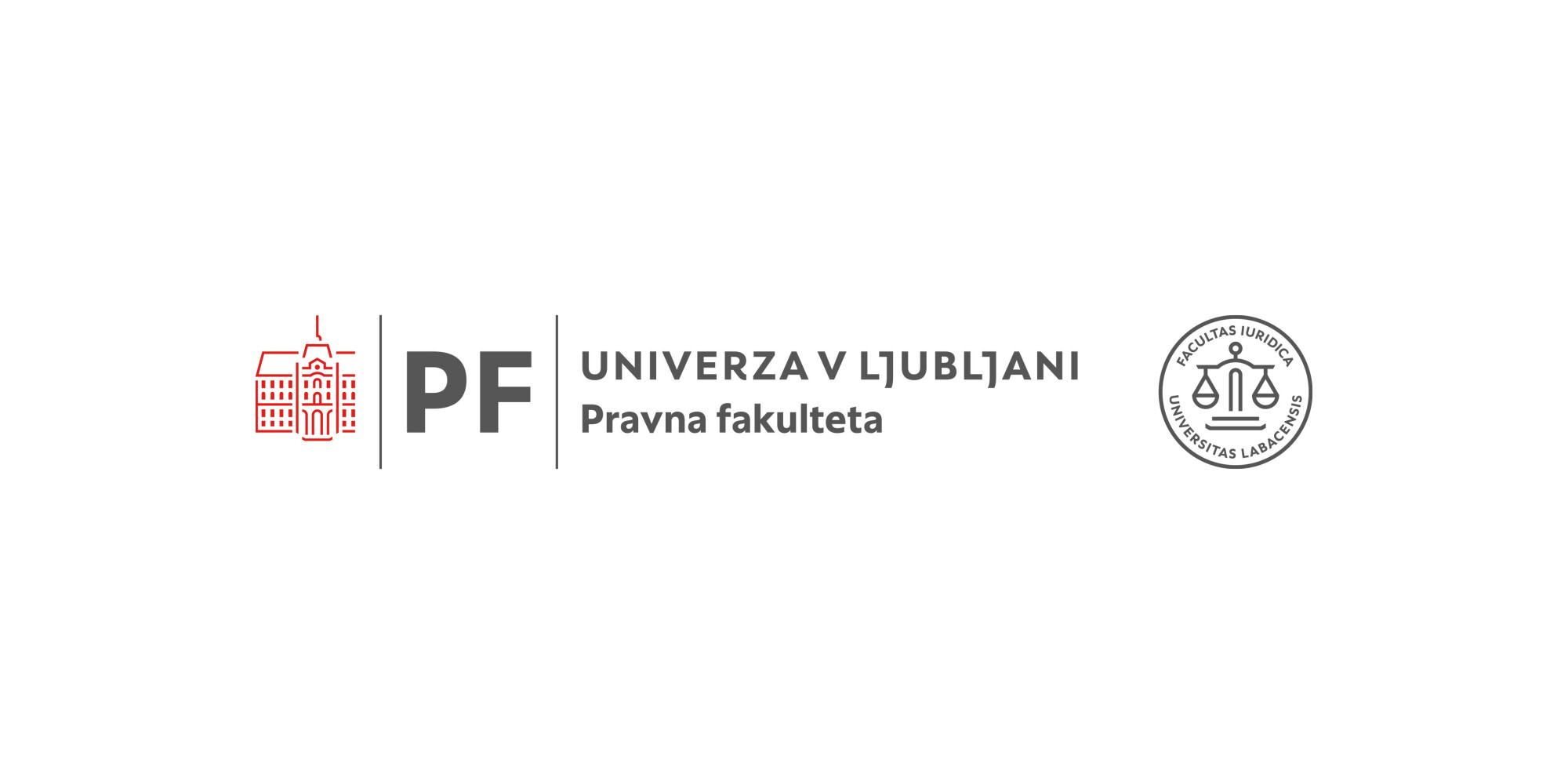
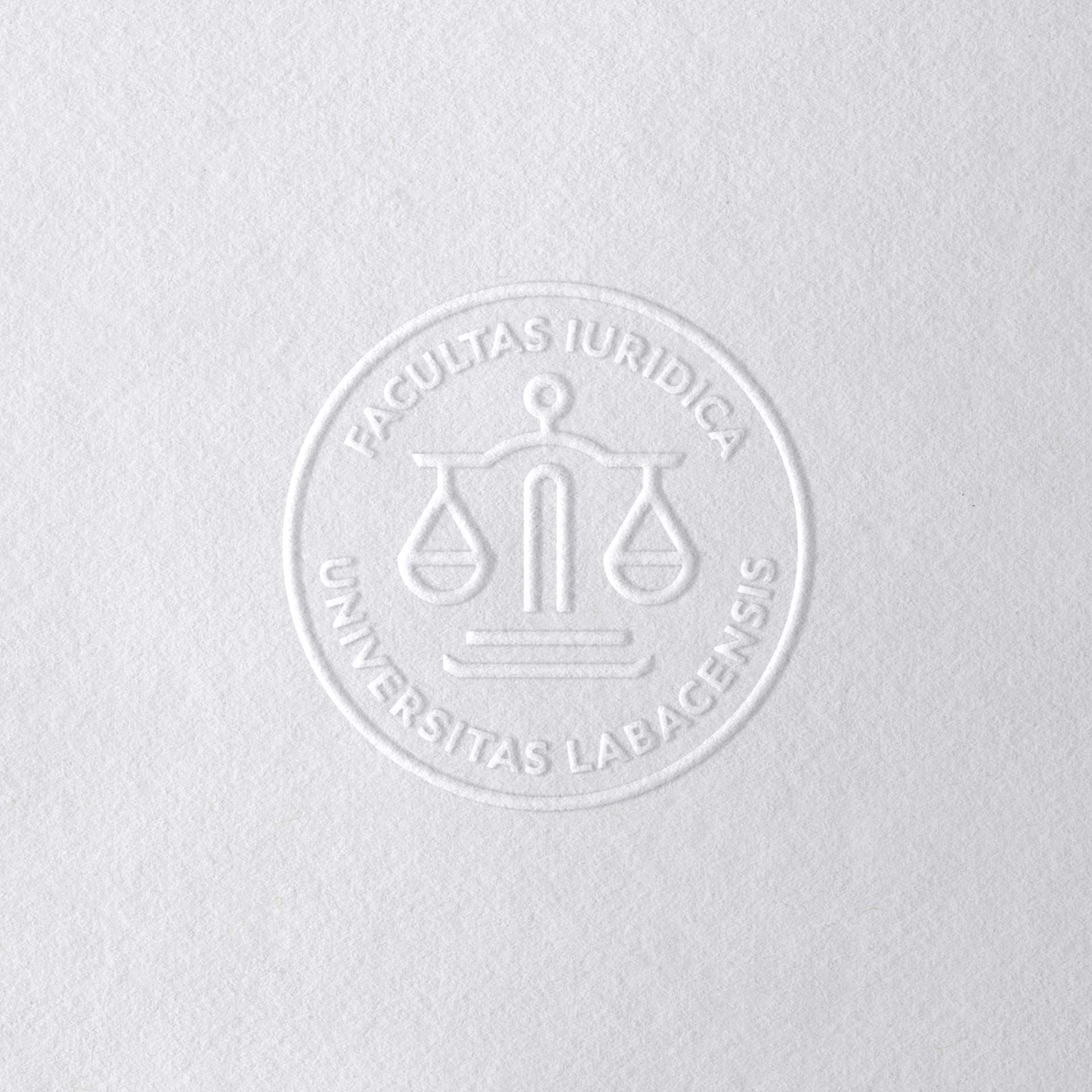
The new design solution is based on the University of Ljubljana’s main symbol – the Carniolan Provincial Manor. Graphic elements – slightly modified, they form the skeleton for the new, more modern symbol representing a clean-looking pair of scales – are borrowed from the manor symbol in a well-thought-out way. The new symbol is logically rounded off with a Latin wording in the University’s typography. It appears in academically subdued shades of blue and grey. It is supposed to be combined with the University of Ljubljana emblem for a visually well-thought-out joint use, as the two symbols are visually harmonised and come to life in symbiosis.
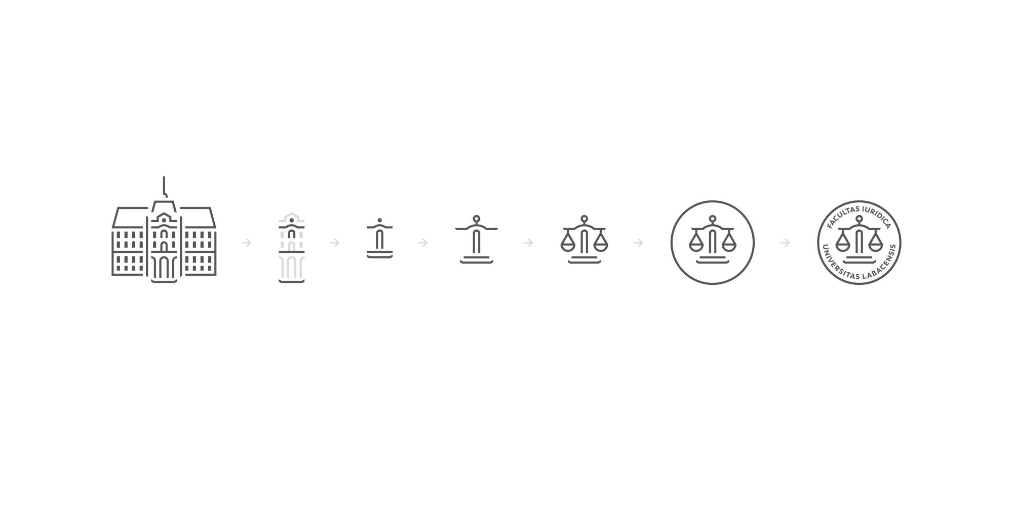
“A pair of scales, as a symbol of fairness in judicial processes, had been the symbol of the Faculty of Law even before the redesign. The aim was to create a new, more modern-looking scales that would be unique to the Ljubljana Faculty of Law, while pairing nicely with the university’s visual identity thanks to the use of the same visual language. The solution lay in the University of Ljubljana’s emblem representing the Carniolan Provincial Manor.”
Kris Andoljšek, Art Director
Uniform Appearance on Various Materials
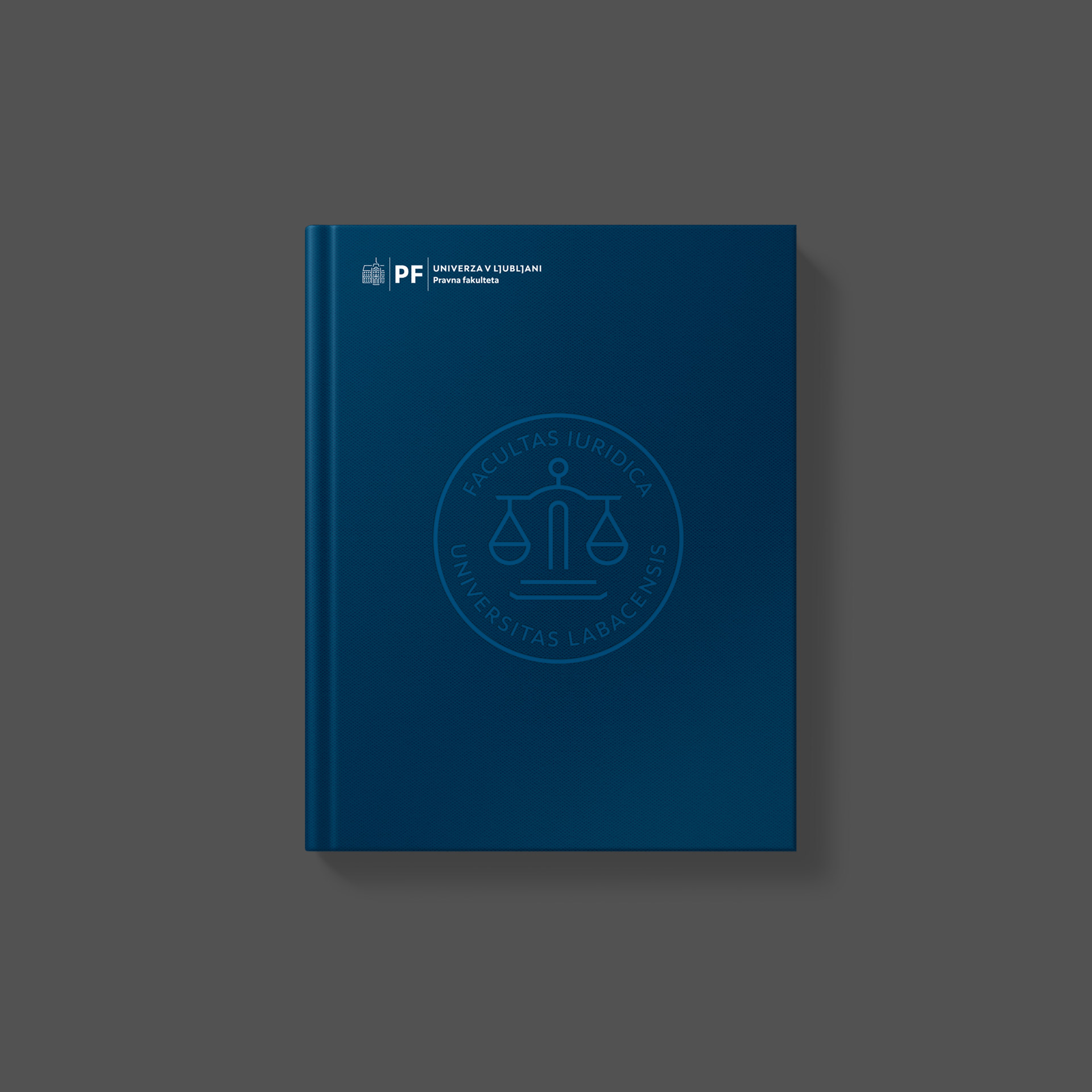
The new visual identity is designed in a way that allows meaningful use on printed materials, in presentations and in the digital environment. The appropriate and uniform use of all the elements is essential to build the visibility of the new visual identity.

Fresh projects are on the way! Sign up for news!
