Where to? To the Ljubljana castle!
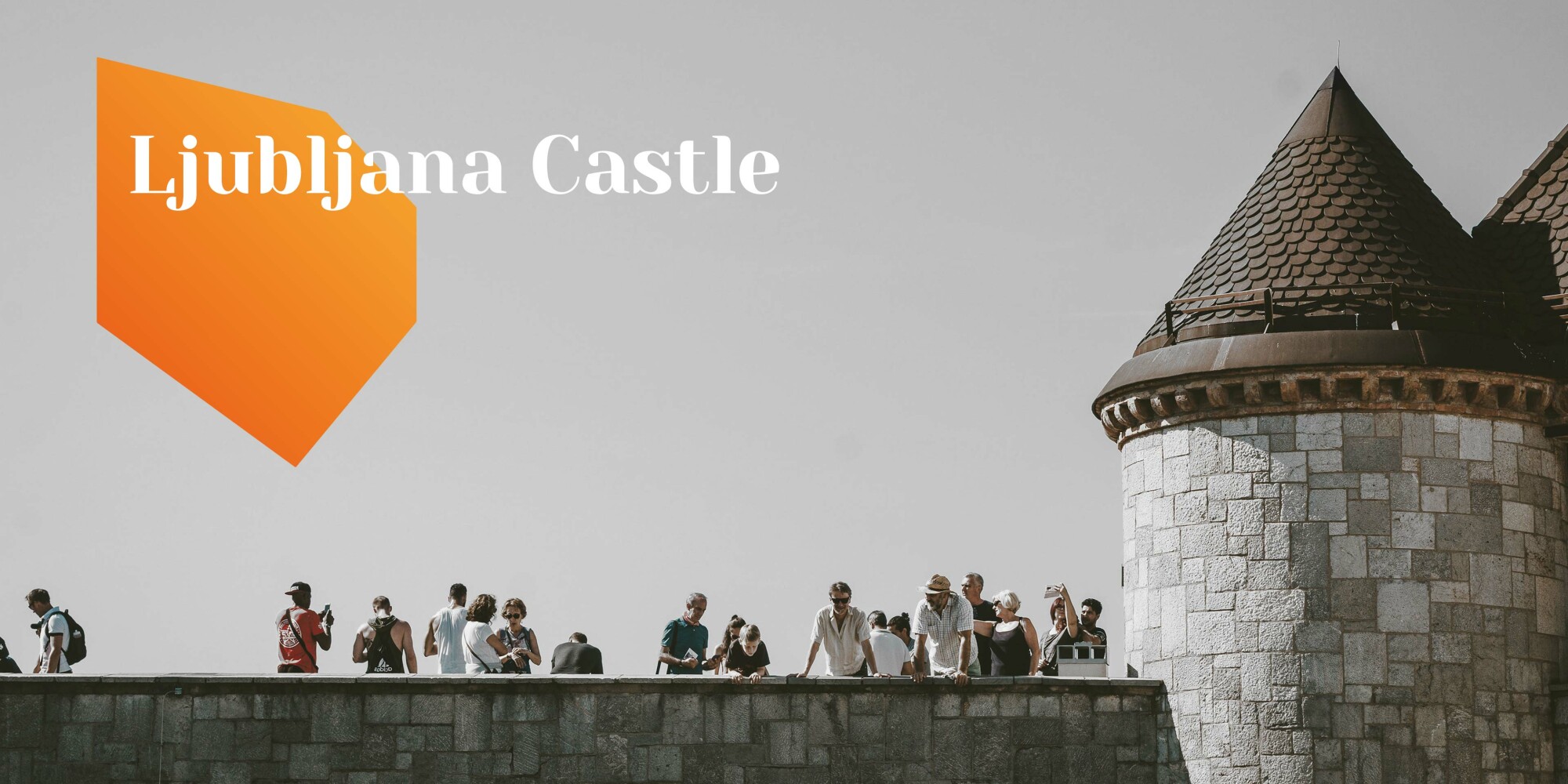
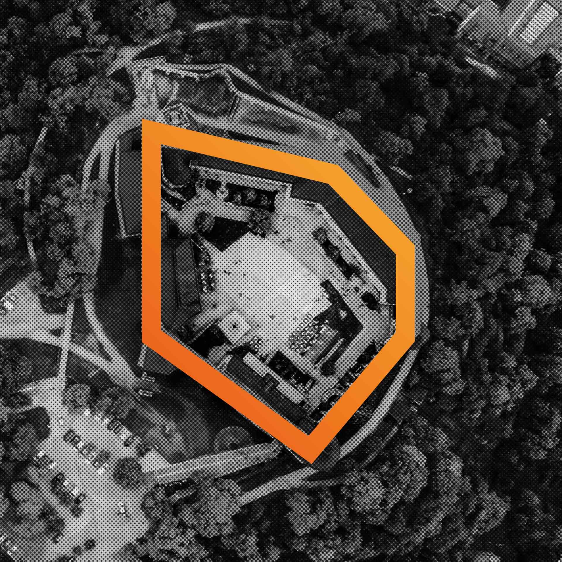
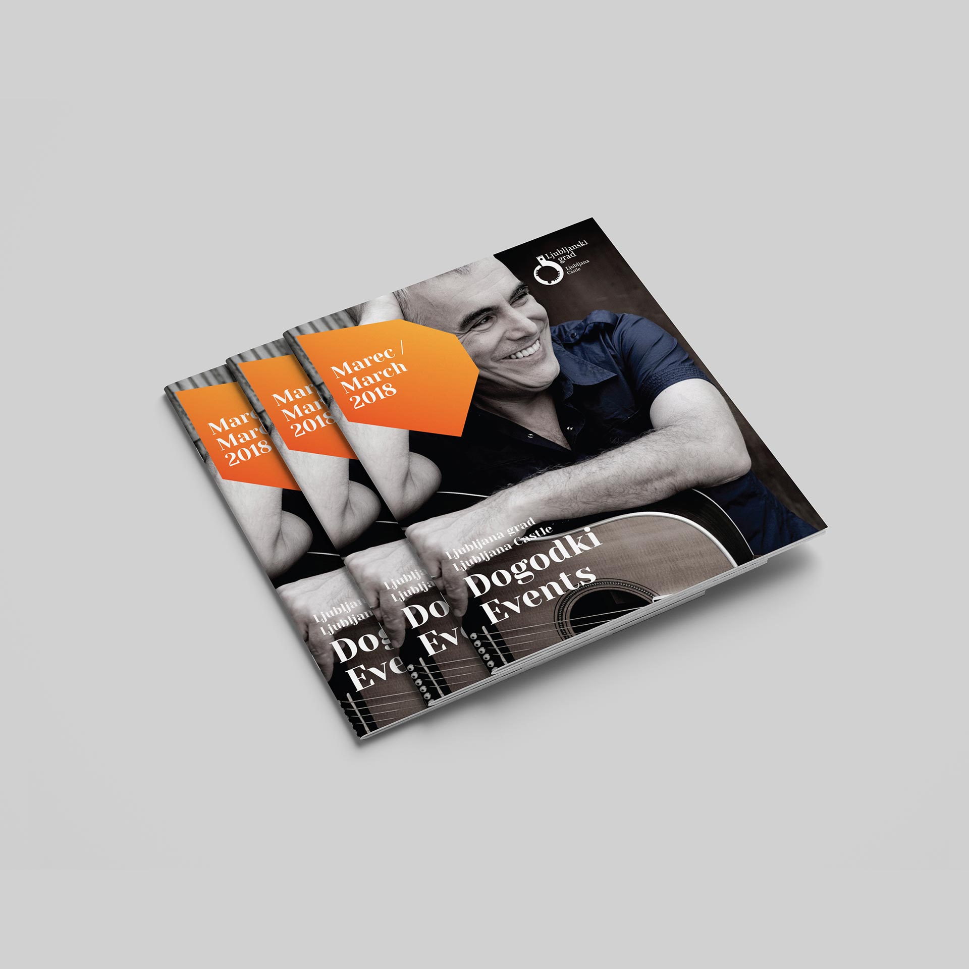
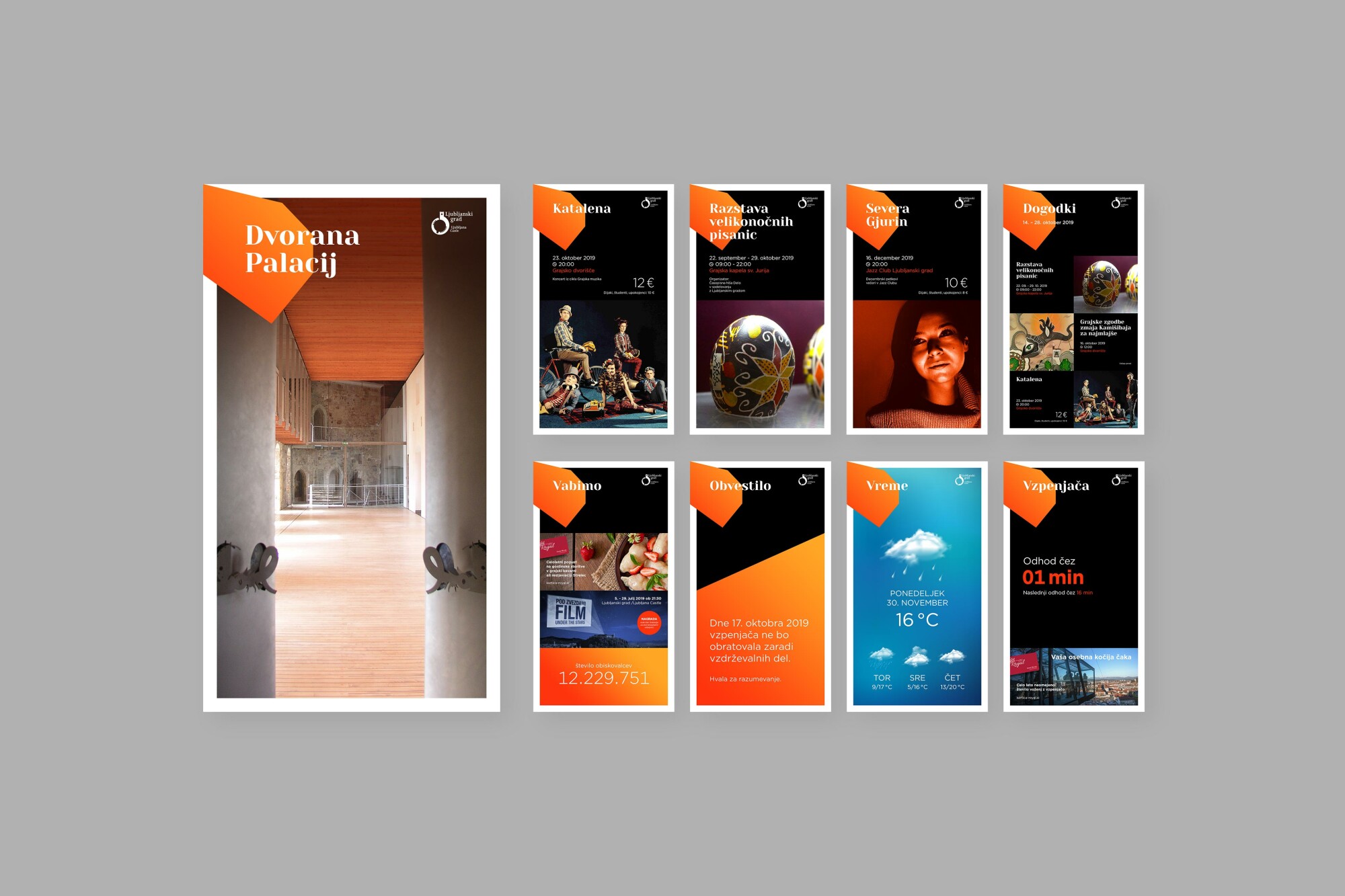
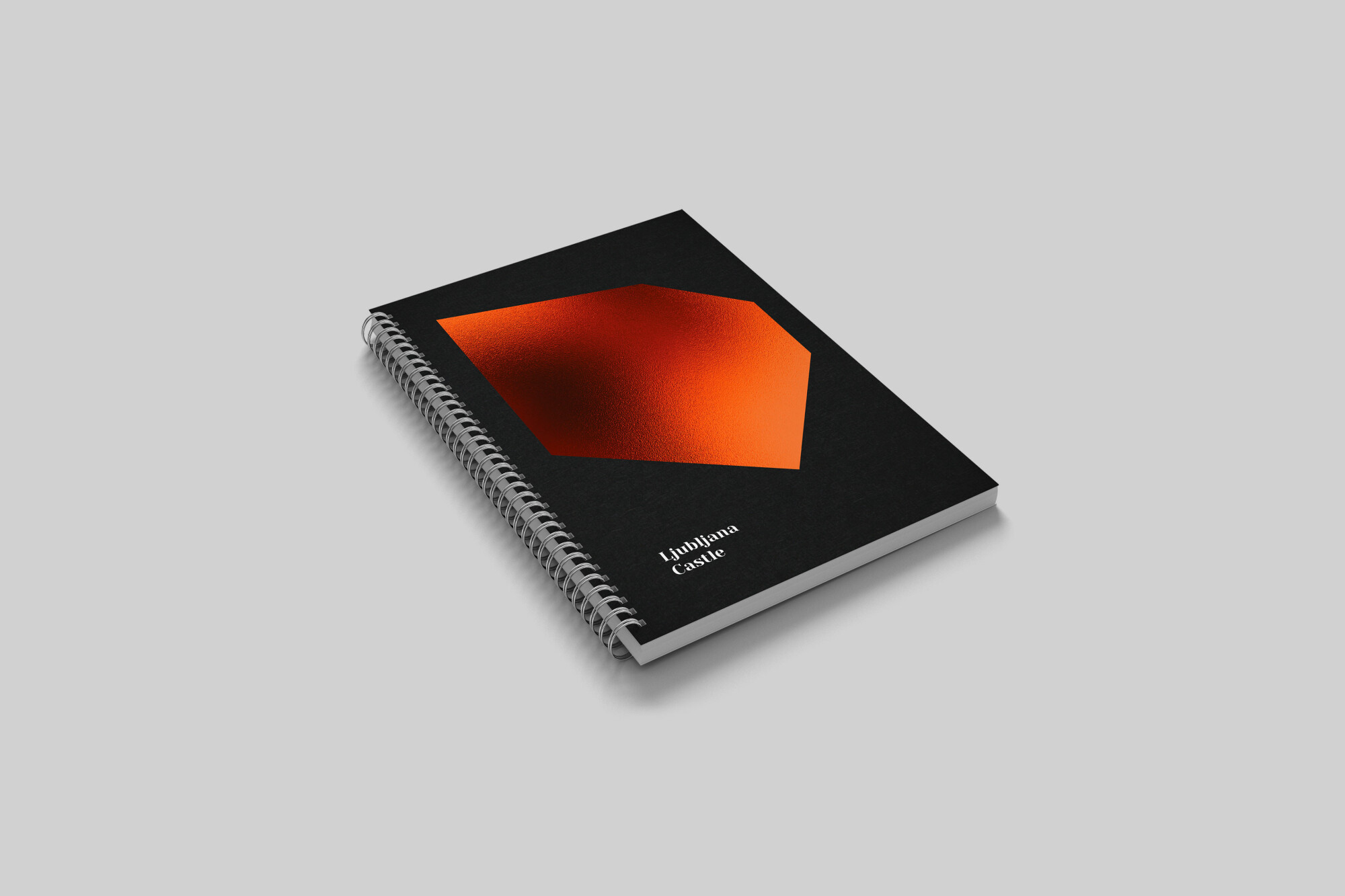
Ljubljana Castle may be a historical city landmark, but its present-day visitors are looking for a modern, different and fresh communication approach, one they can identify with. We developed a completely new and modern visual identity, whose central element is a stylised shape of the castle walls in an easily recognisable orange colour. We designed and built a website, redesigned the visual appearance, improved the user experience and refreshed the website content, which is tailored to Slovenian and foreign visitors. Website visitors are guided around the website by Friderik the Castle Rat, who helps them with various tips and hints, making the entire user experience even more enjoyable.
The Ljubljana Castle website received the Websi Award for first place in the Public and Non-Governmental Organizations category. The Friderik project received the Slovenian Advertising Festival (SOF) Gold Award in the Graphic Design category and Silver Award in the Launch or Renovation of the Brand category, the Brumen Award for excellent Slovenian design and the Netko Award in the Best Online Store category.

Client
Ljubljanski grad
Services
Brand creation
Communication campaign
Graphic and web design
Websites
Categories
Public sector
Culture and Art
Tourism
Website
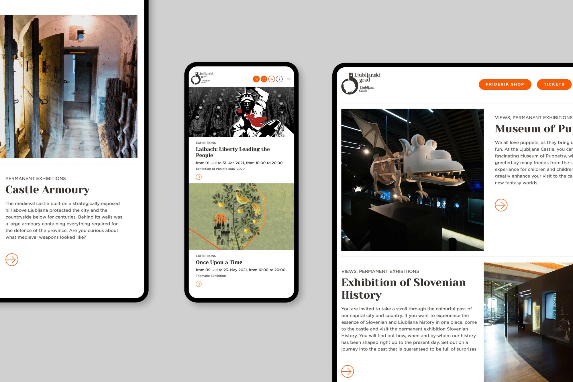
Content tailored to users’ want and needs
The website is focused on the users’ point of view. It is not about the Ljubljana Castle as such, but about everything that the castle has to offer. Primary navigation is structured into sections, providing each target group with a customised presentation of the key content. In technical terms, the website follows a clearly thought-out content-presentation concept. A modular approach has provided the website editors with flexibility in terms of changing the content sequence, i.e. they can move individual elements around, thus creating a clear and eye-catching display of information.
“We've been working with the client for so long and in such an intense way that I feel like I'm part of the Ljubljana Castle team. We’ve all put our heart and soul into our work and have really bonded, which has resulted in the best sort of projects.”
Fresh projects are on the way! Sign up for news!
